Iconography
Iconography is a key visual element that enhances clarity, communication, and user experience. Our icons are designed with a consistent style, ensuring they are simple, recognizable, and aligned with the brand’s aesthetic. They serve as intuitive visual cues, improving navigation and engagement across digital and print applications.
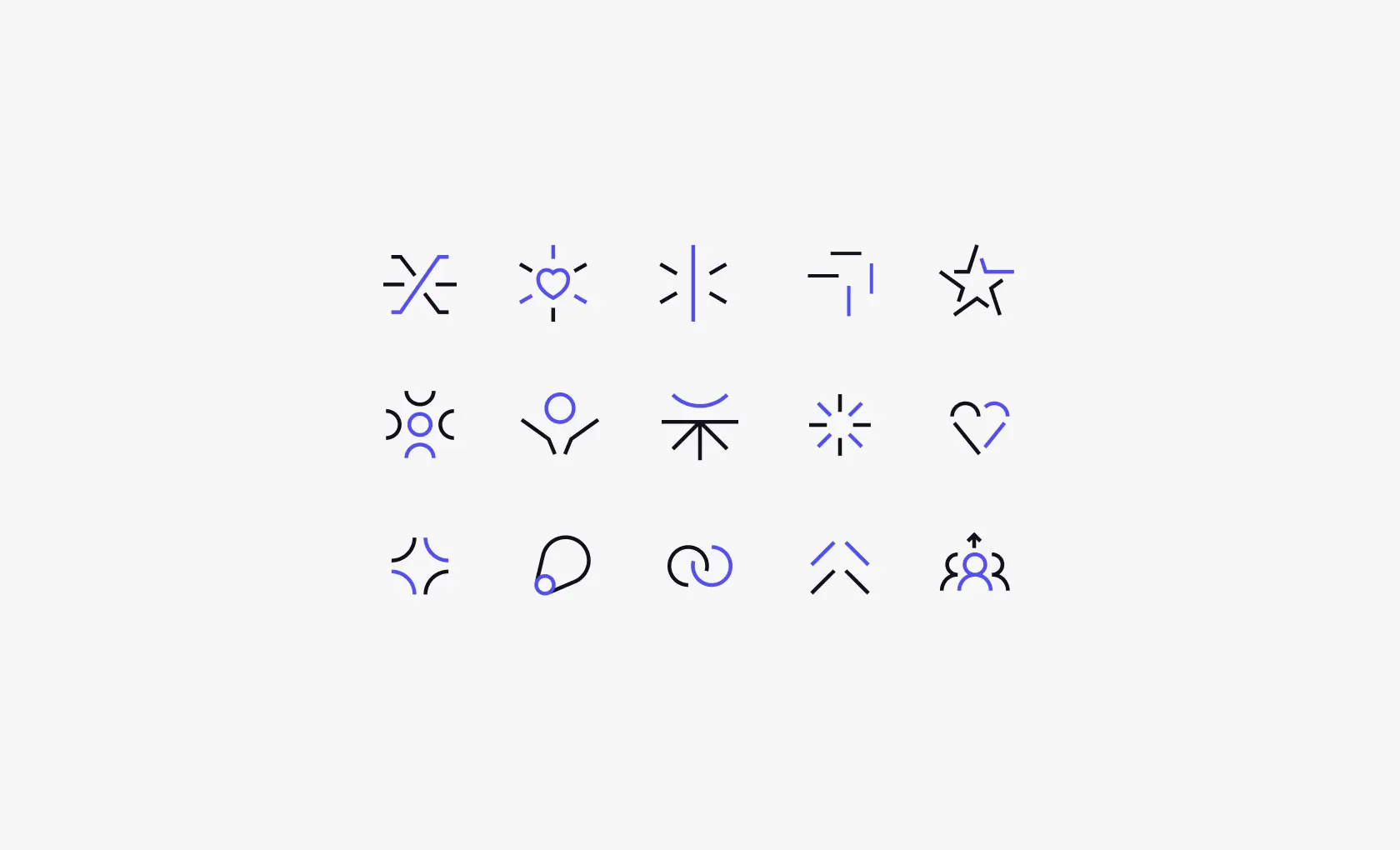
Icon Style
Our icons feature a minimal stroke style, dual-color design, and sharp corners, mirroring the clean, modern aesthetic of our typography for a cohesive brand look.


Icon Grid
The icons follow a grid system to ensure consistent proportions and alignment. This structure maintains uniformity, providing balanced spacing for visual harmony across all icons.
Icon Size: 16px and less
Stroke Weight - 1px
Simplified to maintain clarity at a small scale.
These icons are optimized for compact spaces, ensuring sharp legibility without unnecessary details that could compromise readability.


Icon Size: 17px - 32px
Stroke Weight - 1.5px
Balanced level of detail while keeping the design clean
and recognizable. This size range offers versatility, making the icons adaptable across interfaces while maintaining a consistent brand aesthetic.

Icon Size: 33px - 64px
Stroke Weight - 3px
Allows for more visual depth while maintaining simplicity. The increased stroke weight provides better visibility and impact, ensuring the icons stand out while preserving their refined and modern look.

Icon Library
The icon library offers a consistent set of icons, designed for versatility and aligned with the brand’s visual style, ensuring seamless use across all platforms and efficient way to access icons.