
Typography
Our typography plays a crucial role in communicating our brand’s voice with clarity and impact. We use carefully selected typefaces to ensure consistency across all platforms. The combination of modern letterforms and legibility allows us to maintain a strong and cohesive brand identity.
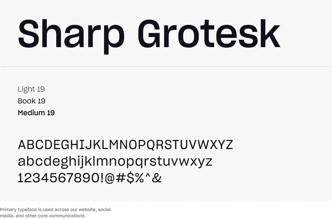
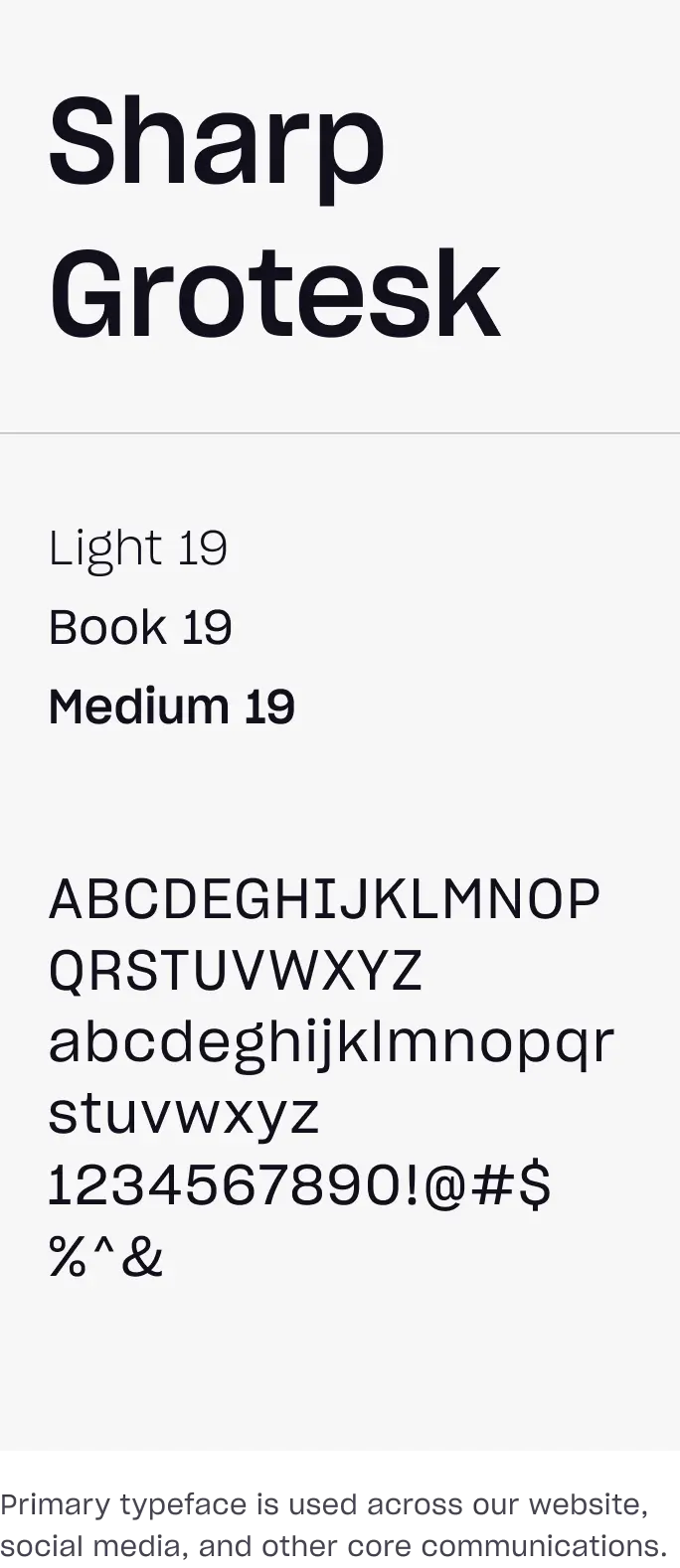
Primary Typeface
Sharp Grotesk is our primary typeface. The modern and sharp letterforms reflect our brand's forward-thinking and professional approach, ensuring a impactful presence in all digital spaces.
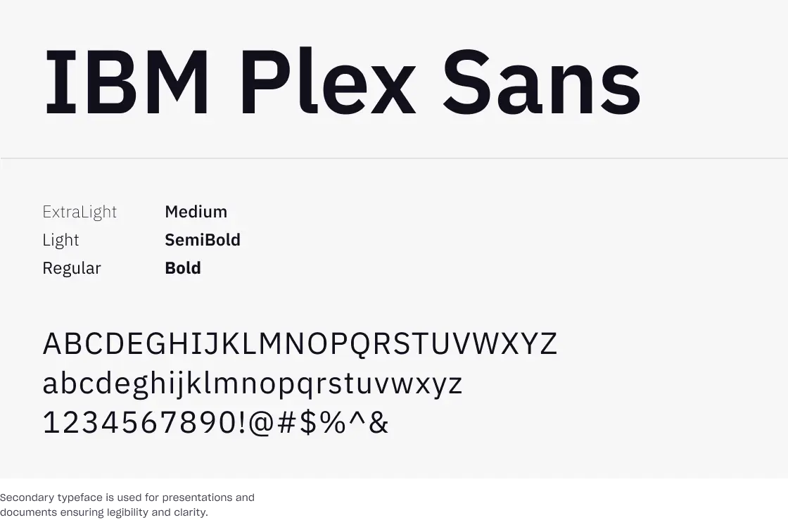
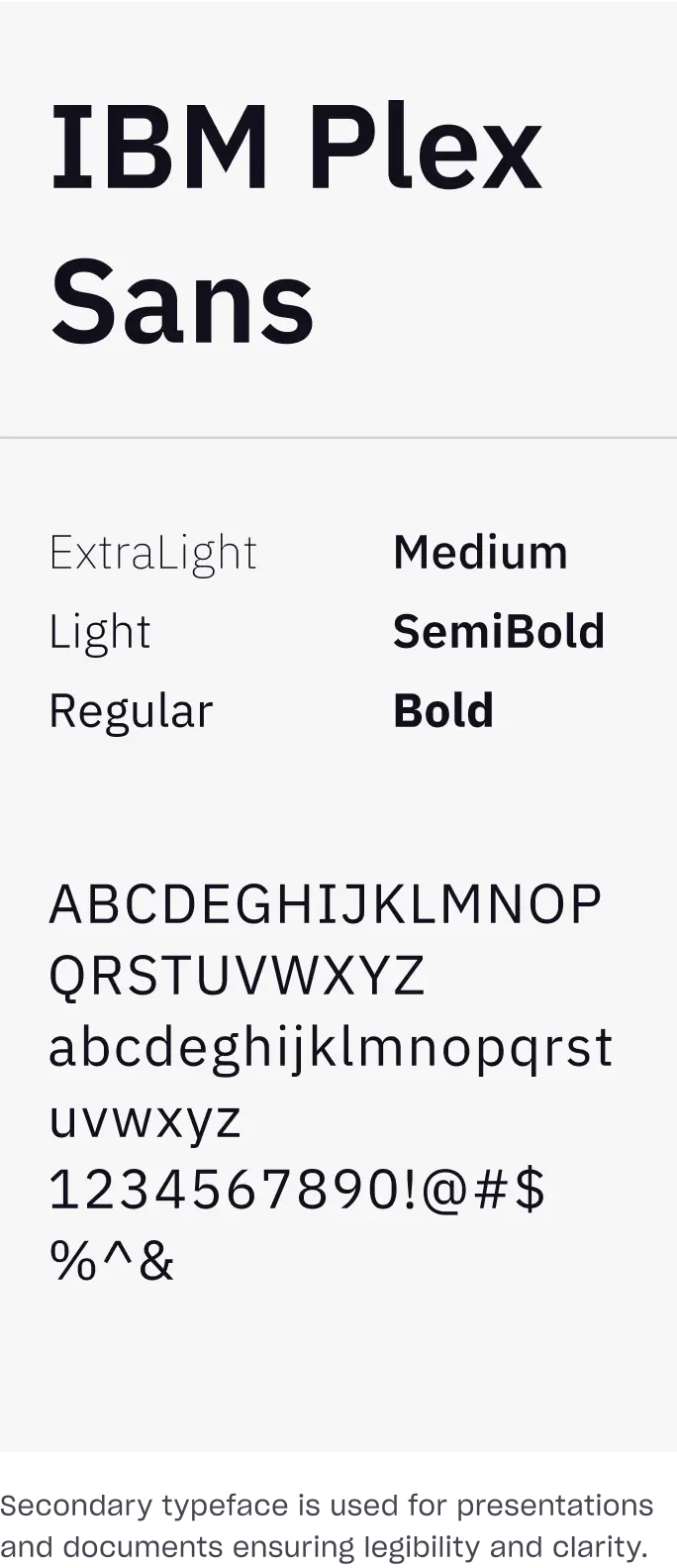
Secondary Typeface
IBM Plex Sans is our secondary typeface. Its versatility and clarity make it ideal for extended text, providing excellent legibility and professional tone that complements our primary typeface.
Type Hierarchy
Typography hierarchy is essential for creating a clear, organized, and visually appealing layout. It ensures that content is structured in a way that guides the reader’s attention from the most important to the least important elements.
Title
Sharp Grotesk Book
Heading
Sharp Grotesk Light
Driving excellence
Paragraph Title
Sharp Grotesk Medium
Your individuality is your superpower
Sub Title
Sharp Grotesk Light
Description
Sharp Grotesk Book

